

Henrieke Otte is an accomplished writer and content editor, specializing in topics that inspire thoughtful living—ranging from global travel and sustainable lifestyles to interior design and architecture. With a keen editorial sense and a background in cultural studies, Henrieke brings depth, elegance, and clarity to every piece she crafts.
Her work is known for its engaging voice, visual sensitivity, and ability to turn complex ideas into accessible, reader-friendly narratives. Whether exploring eco-conscious destinations, dissecting climate-conscious home trends, or curating serene living spaces, Henrieke writes with a balance of creativity and insight that resonates with design-savvy, environmentally aware audiences.
Driven by a love of meaningful storytelling and a refined aesthetic, Henrieke contributes regularly to digital platforms and magazines where quality content meets visual sophistication.
Bold Typography Takes Center Stage
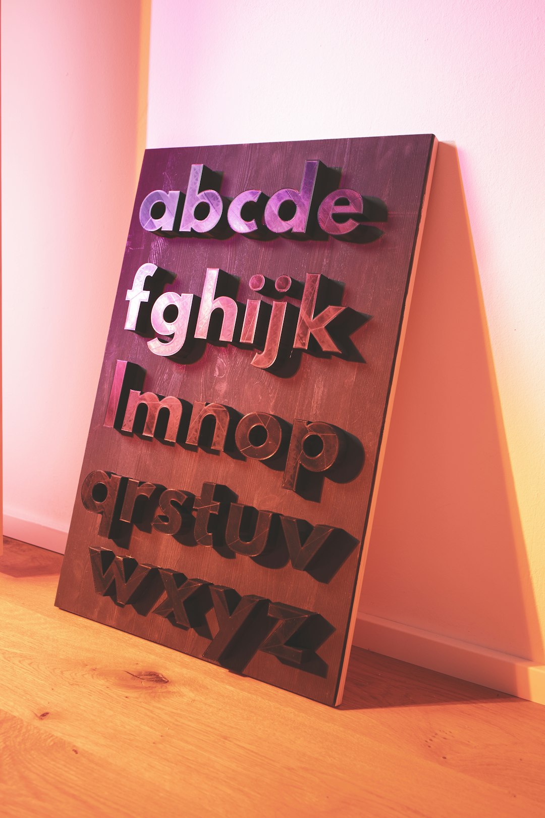
Typography is no longer just a supporting character in design—it’s stepping into the spotlight as the star of the show. Big Typography uses oversized, bold text as the main visual element. Large, bold fonts dominate the composition, turning text into a key visual element. Minimalism is coming into 2025 with a much stronger and bolder impact. Look out for designs with few elements, but with heavy emphasis on the ones that are featured. Bold typography and color palettes across stripped-back, simple designs are something we expect to see more of this coming year.
The beauty of this trend lies in its immediate impact. We noticed bold and strong typography choices were the primary features, often paired with equally bold and strong color palettes. From indie coffee shops ditching vintage aesthetics to major brands like PayPal embracing chunky sans-serif lettering, the message is clear: if you want to be heard, you need to be bold.
The AI Revolution in Creative Workflows
More and more designers are integrating AI into their design workflows as a personal assistant to help with inspiration and ideation, as well as to add finishing touches to designs. In the right hands, AI can be an incredibly powerful tool for creating designs both unique and extraordinary. However, this isn’t about replacing human creativity—it’s about amplifying it. As far as UX design trends go, 2025 marks a turning point for how AI is perceived in the UX industry. Now, with more hands-on experience, UX professionals have a clearer, more realistic picture of AI’s strengths and limitations. We’re essentially moving beyond the initial hype towards more thoughtful, value-driven integration of AI into the UX workflow.
Smart designers are using AI to handle repetitive tasks while reserving strategic thinking and creative problem-solving for themselves. AI tools have become a designer’s best friend, helping create stunning visuals faster than ever. In 2025, we’re seeing AI-generated illustrations, patterns, and layouts combined with human creativity. The key is knowing when to use AI and when to rely on human intuition.
Handcrafted Aesthetics Against Digital Perfection
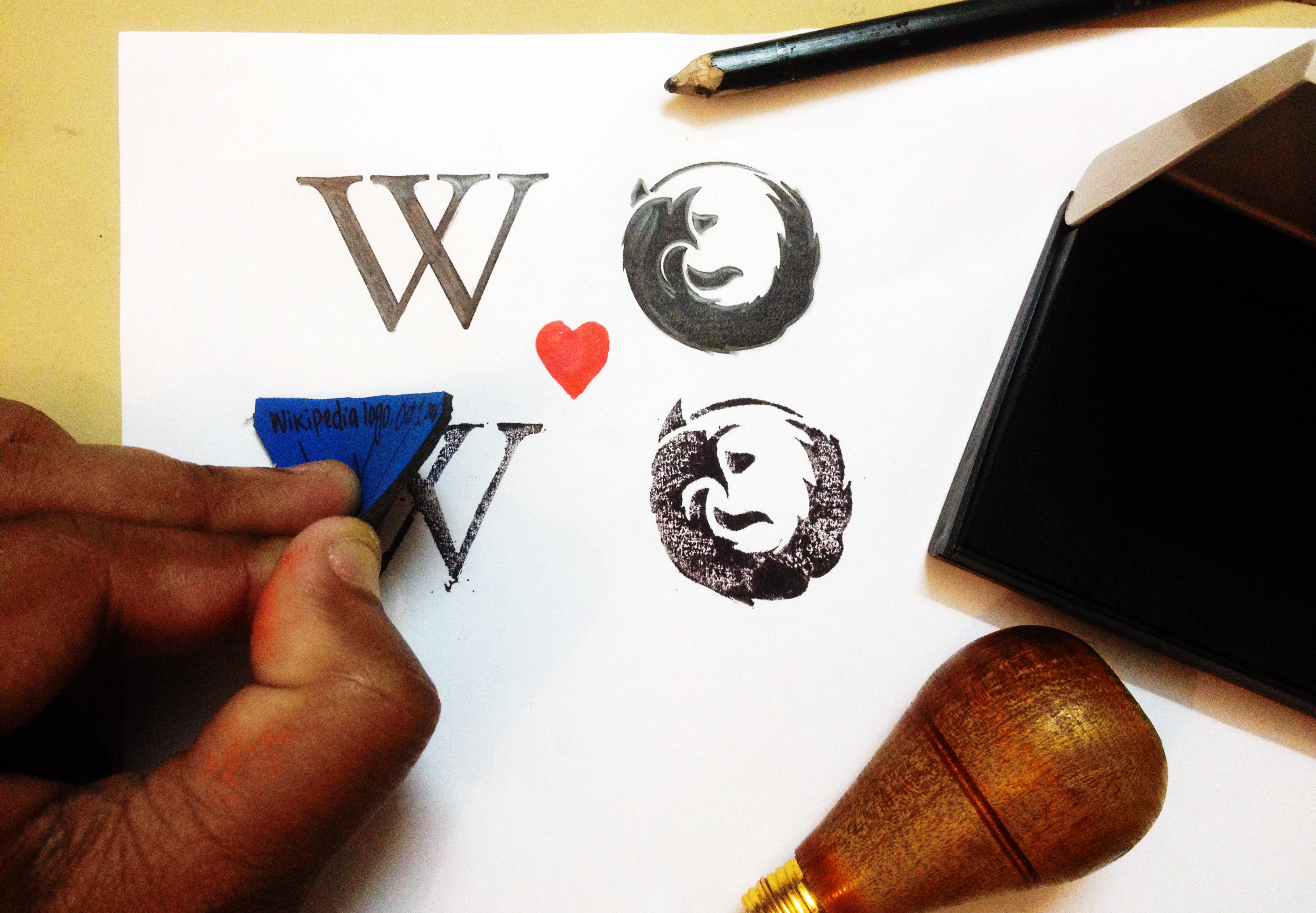
In a world increasingly dominated by pixel-perfect AI-generated content, there’s a growing hunger for the beautifully imperfect. In 2025 the unwavering power of a hand-drawn logo is wiggling its way into branding and graphics everywhere. Industries most affected will be the food and beverage industry – with some craft and artisanal businesses. Handmade illustrations, doodles, and honestly anything that looks like it was made by human hands is a prime trend in 2025. This trend is all about reconnecting with people and adding a sense of fun and emotional connection.
The scrapbook aesthetic is making a major comeback too. The original “copy and paste” involved glue and scissors – the physical look of arranging images together has returned to create a nostalgic and human graphic design trend. Combining digital assets like photos, textures, abstract shapes, and handwritten elements creates a “scrapbook aesthetic” that feels personal and tactile. This trend thrives on its raw, unpolished appeal, giving brands a human, relatable edge.
Grainy Textures and Analog Rebellion
Perhaps indicative of the industry’s need for a little imperfection during a time wherein flawless AI-generated imagery has become ubiquitous, the use of textured grains in graphic design is on the rise. Used to add depth and movement, throwing a little texture into your work can make it feel more tangible, raw, and edgy. Designers are deliberately adding noise, grain, and imperfections to their work—almost like a visual rebellion against the sterile perfection of digital tools.
In a rebellion of AI-generated imagery, we’re seeing a shift towards the earthy and analog, using elements such as organic lettering, earthen textures, and hand-crafted elements — think scrapbooking and hand-drawn doodles. As we’ve discussed with grainy textures, a pivot towards more natural aesthetics is coming our way in 2025. This trend speaks to our collective desire for authenticity in an increasingly synthetic world.
Nature-Inspired Design Elements
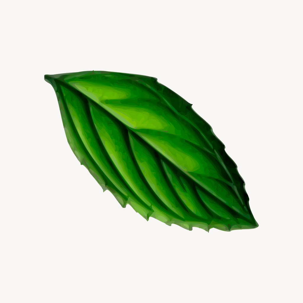
Environmental consciousness is reshaping design choices, with organic shapes and natural textures taking center stage. Expect more organic shapes, earthy color palettes and designs that mimic nature in the upcoming year. As sustainability continues to be a core focus for many global brands, we’ll likely see design choices that evoke a sense of serenity and eco-consciousness. The increased focus on sustainability is driving customers to favor brands that prioritize eco-friendly and ethical practices. This shift is reflected through visual identities that incorporate natural patterns, textures, earthy colors, organic shapes, and nature-inspired elements like leaves, trees, flowers, birds, or water. These design choices represent a brand’s commitment to environmental responsibility and strongly resonate with the growing base of eco-conscious consumers, making it a top trend that will hold relevance in 2025.
The movement goes beyond just adding a few leaves to your design. Another captivating aspect of this trend is incorporating natural movements into logo designs. Logos can embody the fluidity found in nature, from gentle swaying leaves and flowing water, to a fusion between industry and nature. Build a strong connection with consumers who seek eco-friendly and authentic brands by creating a visual narrative that intertwines natural beauty with your sustainability values.
Metallic Aesthetics and Future Dust
Chrome, silver, and metallic finishes are making a significant comeback as designers embrace a more futuristic aesthetic. Shades of silver, chrome, and other metallic hues are set to rise in popularity in 2025 with the metal aesthetic seeping into many more designs towards the end of the year. With WGSN and Coloro declaring Future Dust (a dark blue with hints of purple and grey) as “Color of the Year,” we can only expect this color and similar shades to become dominant over time.
This trend represents a fascinating duality—while we’re embracing analog textures on one hand, we’re also pushing toward sci-fi aesthetics on the other. The metallic trend works particularly well for tech companies, luxury brands, and any business looking to convey innovation and premium quality. It’s about creating designs that feel both cutting-edge and timeless.
The Return of Earthy Color Palettes
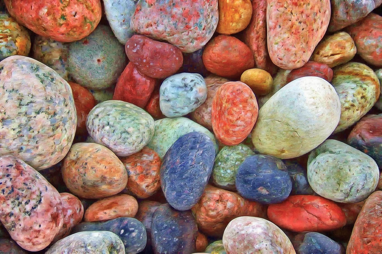
Say goodbye to the neon chaos of recent years. Collectively, we’ve decided we need to touch grass in 2025. That can feel dramatic in the context of color trends – but it’s true. Color authorities like Benjamin Moore, Behr, and Pantone all chose neutral, rich, grounding colors as their color of the year. Looka’s 2025 logo data told the same story – 22% of logo designers chose a shade of brown as one of their logo colors. 14% chose clay #c99383 as their logo color, and 8% chose wood #b17a50.
2025 will be a ride, and folks are buckling in for some ups and downs. These opulent neutrals offer a haven for stability, peace, and coziness. And lastly, Pantone chose Mocha Mousse as their Pantone 2025 color of the year. So, if you’re in doubt – choose a neutral, grounding tone to connect with folks this year. Creating a safe and cozy atmosphere with design seems to resonate with today’s culture.
Maximalist Illustrations and Visual Chaos
While minimalism still has its place, there’s a growing appetite for visual complexity and richness. When it comes to illustration in 2025, more is more. We’re expecting to see a variety of elaborate and complex illustrations that are busy, colorful, and vibrant. This trend allows you to capture your audience’s attention and force them to slow down to acknowledge the detail of your work.
This isn’t about cramming random elements together—it’s about creating purposeful complexity that rewards closer inspection. The maximalist approach works particularly well for brands that want to showcase their creativity, attention to detail, or cultural richness. Think of it as the visual equivalent of a detailed novel versus a tweet.
Interactive 3D Elements and Spatial Design

Three-dimensional design elements are evolving beyond static decoration to become functional parts of the user experience. Interactive 3D elements have become a cornerstone of modern web design, evolving far beyond the static, decorative roles they once played. Today, these elements are dynamic and interactive, actively shaping the user journey and enhancing the overall experience. Immersive storytelling: 3D elements are now woven into the narrative of websites, guiding users through stories or processes in visually captivating ways. Enhanced engagement: Interactivity encourages exploration, keeping users engaged and more connected to the content.
Far from being just a novelty, 3D design and animation are defining features of contemporary graphic design. These techniques bring realistic depth and movement to projects, enhancing the viewer’s experience. By 2025, expect even more immersive and refined 3D visuals. This trend represents the convergence of gaming aesthetics with traditional design, creating experiences that feel more like interactive environments than static compositions.
Experimental Typography and Anti-Design
Traditional design rules are being deliberately broken as designers embrace experimental approaches. Anti-design – From cluttercore to experimental typography, you have to push those boundaries! Asymmetrical layouts and extreme unbalance? Do it. Overlapping artwork and clashing colors? Hard yes. The anti-design 2025 web design trend leans towards breaking traditional rules and embracing asymmetrical layouts or unbalance.
Gone are the days of cautiously selected font pairs, and traditional font styles. We’re seeing a wave of whimsical and creative fonts take over font databases. Exaggerated strokes, playful ligatures, and elongated stems can create visually striking wordmark logos. This isn’t chaos for chaos’s sake—it’s about creating memorable experiences that stand out in an oversaturated visual landscape. The key is maintaining enough structure to ensure usability while pushing creative boundaries.

Henrieke Otte is an accomplished writer and content editor, specializing in topics that inspire thoughtful living—ranging from global travel and sustainable lifestyles to interior design and architecture. With a keen editorial sense and a background in cultural studies, Henrieke brings depth, elegance, and clarity to every piece she crafts.
Her work is known for its engaging voice, visual sensitivity, and ability to turn complex ideas into accessible, reader-friendly narratives. Whether exploring eco-conscious destinations, dissecting climate-conscious home trends, or curating serene living spaces, Henrieke writes with a balance of creativity and insight that resonates with design-savvy, environmentally aware audiences.
Driven by a love of meaningful storytelling and a refined aesthetic, Henrieke contributes regularly to digital platforms and magazines where quality content meets visual sophistication.